Describing Distributions
In various data analyses, we often need to visualize distributions of various quantative varibles. There are quite a few ways to do this, and I often find myself needing to explain them, so I thought I’d write them down for future reference and hopeful general usefulness.
Preliminaries
I will use Python + Pandas for analysis and the excellent Plotnine for visualization.
from zipfile import ZipFile
import pandas as pd
import numpy as np
import plotnine as pn
pn.theme_set(pn.theme_classic() + pn.theme(figure_size=(7, 4.5)))The examples will use the latest MovieLens data set (ML-32M).
with ZipFile('ml-32m.zip') as zf:
    with zf.open('ml-32m/ratings.csv') as csvf:
        ratings = pd.read_csv(csvf)
ratings.info()
<class 'pandas.core.frame.DataFrame'>
RangeIndex: 32000204 entries, 0 to 32000203
Data columns (total 4 columns):
# Column Dtype
--- ------ -----
0 userId int64
1 movieId int64
2 rating float64
3 timestamp int64
dtypes: float64(1), int64(3)
memory usage: 976.6 MBWe’ll look specifically at distributions of various user and item statistics.
user_stats = ratings.groupby('userId')['rating'].agg(['mean', 'count'])
item_stats = ratings.groupby('movieId')['rating'].agg(['mean', 'count'])
Let’s also compute combined stats.
combined_stats = pd.concat({'user': user_stats, 'item': item_stats}, names=['type', 'id'])
combined_stats = combined_stats.reset_index()
combined_stats.head()| type | id | mean | count | |
|---|---|---|---|---|
| 0 | user | 1 | 3.531915 | 141 |
| 1 | user | 2 | 4.269231 | 52 |
| 2 | user | 3 | 3.588435 | 147 |
| 3 | user | 4 | 2.629630 | 27 |
| 4 | user | 5 | 3.272727 | 33 |
Basic Descriptions
The classical, first way that we typically learn to draw distributions is a histogram. It’s a good first approach, and generally works well for symmetrical or bounded distributions.
(
    pn.ggplot(item_stats)
    + pn.aes(x='mean')
    + pn.geom_histogram(bins=20)
    + pn.labs(x='Mean Rating', y='# of Items')
    + pn.ggtitle("Distribution of Movie Average Ratings")
)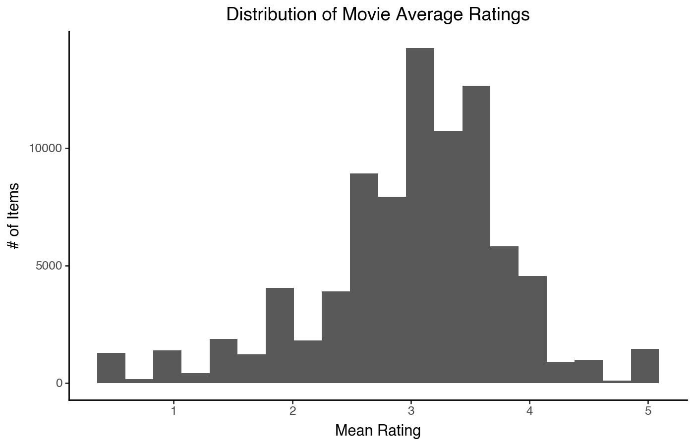
We can see that the ratings look slightly left-skewed, and there are peaks at whole and half rating values (likely resulting from a large number of movies with a single rating). We can compute some statistics to go with this:
item_stats['mean'].describe()count 84432.000000
mean 3.005082
std 0.801820
min 0.500000
25% 2.543478
50% 3.071429
75% 3.500000
max 5.000000
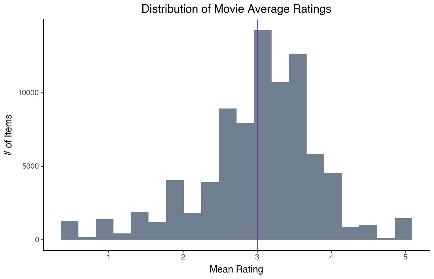
Name: mean, dtype: float64We can also do a few variants on this display — for example, overlay the mean:
(
    pn.ggplot(item_stats)
    + pn.aes(x='mean')
    + pn.geom_histogram(bins=20, fill='slategray')
    + pn.geom_vline(xintercept=item_stats['mean'].mean(), color='rebeccapurple')
    + pn.labs(x='Mean Rating', y='# of Items')
    + pn.ggtitle("Distribution of Movie Average Ratings")
)
We can also do a kernel density instead of a histogram:
(
    pn.ggplot(item_stats)
    + pn.aes(x='mean')
    + pn.geom_density()
    + pn.geom_vline(xintercept=item_stats['mean'].mean(), color='rebeccapurple')
    + pn.labs(x='Mean Rating', y='Item Density')
    + pn.ggtitle("Distribution of Movie Average Ratings")
)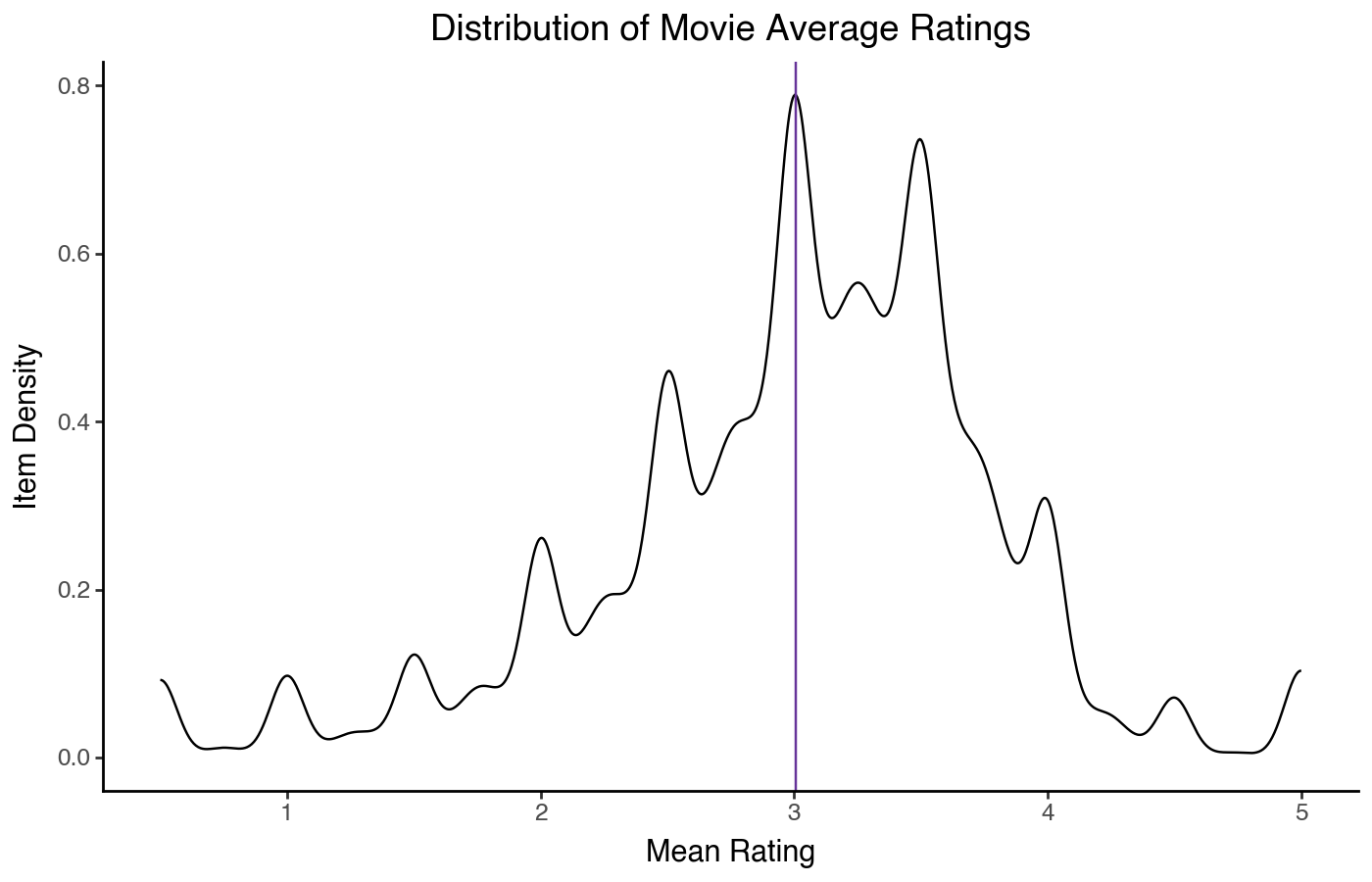
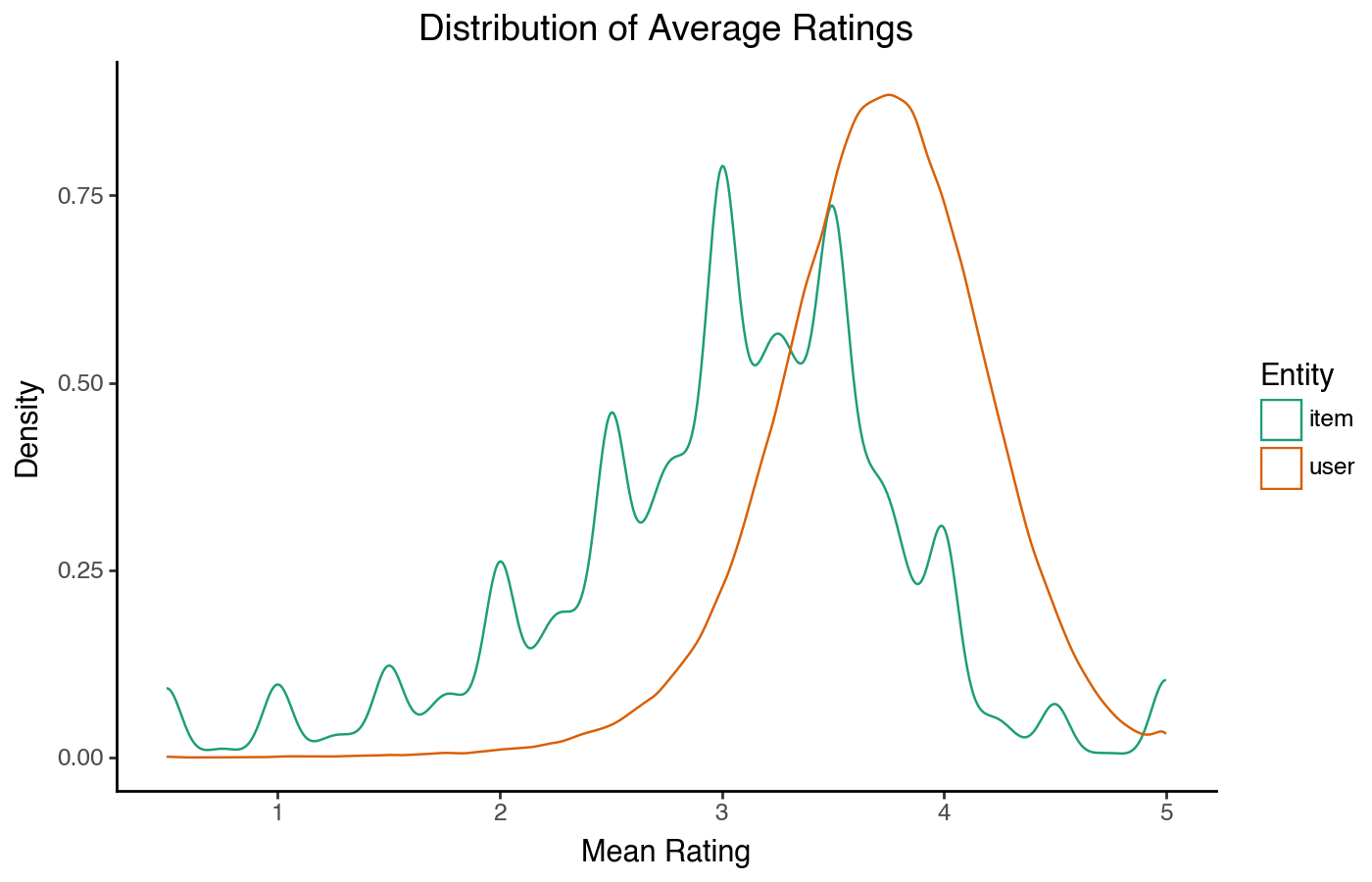
The density plot shows the same shape, although without an intepretable X axis. It has the advantage that it is easier to overlay density plots than histograms if we want to compare two distributions:
(
    pn.ggplot(combined_stats)
    + pn.aes(x='mean', color='type')
    + pn.geom_density()
    + pn.scale_color_brewer('qual', 'Dark2')
    + pn.labs(x='Mean Rating', y='Density', color='Entity')
    + pn.ggtitle("Distribution of Average Ratings")
)
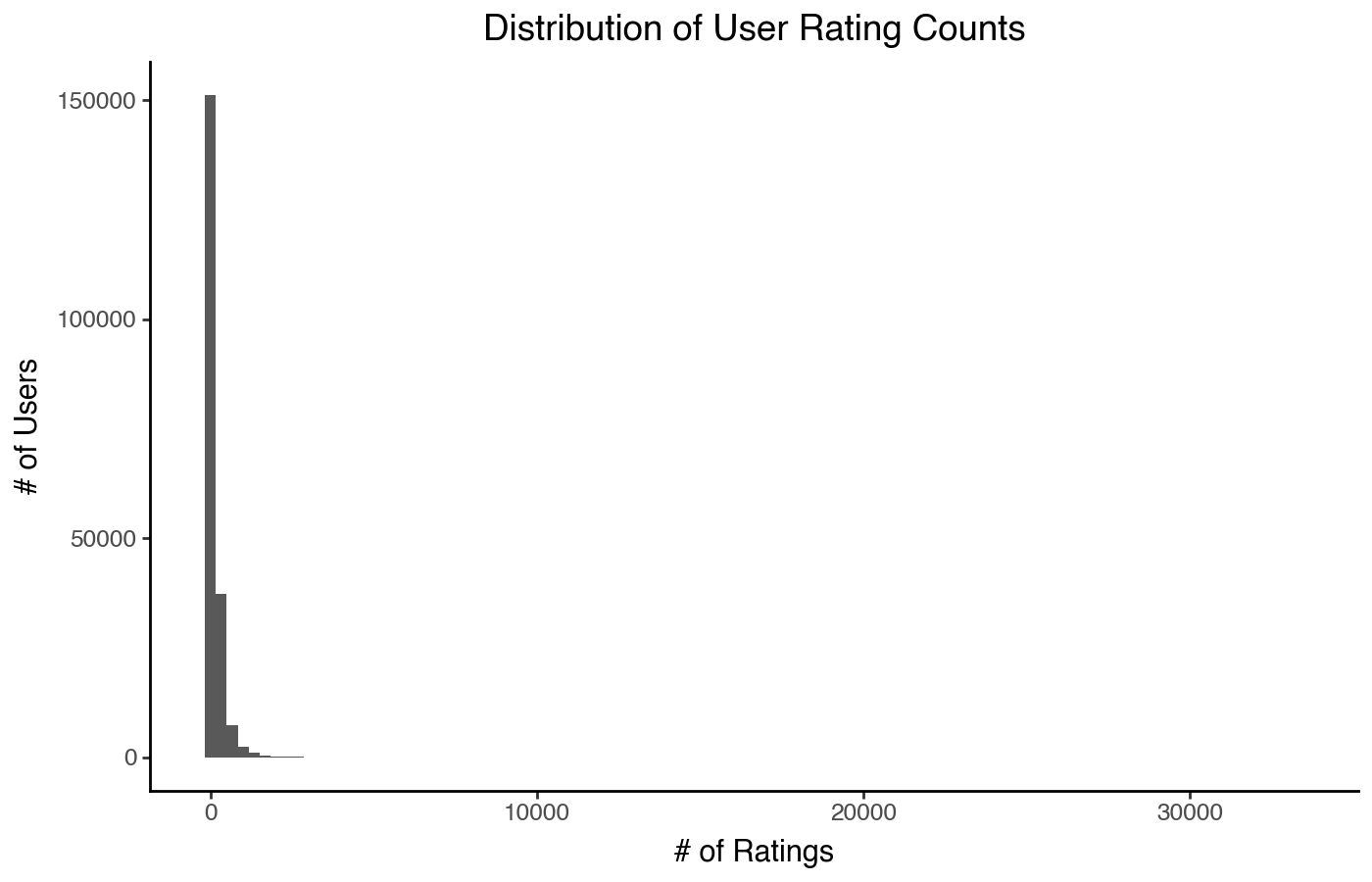
But what if we have a highly skewed distribution?
(
    pn.ggplot(user_stats)
    + pn.aes(x='count')
    + pn.geom_histogram(bins=100)
    + pn.labs(x='# of Ratings', y='# of Users')
    + pn.ggtitle("Distribution of User Rating Counts")
)
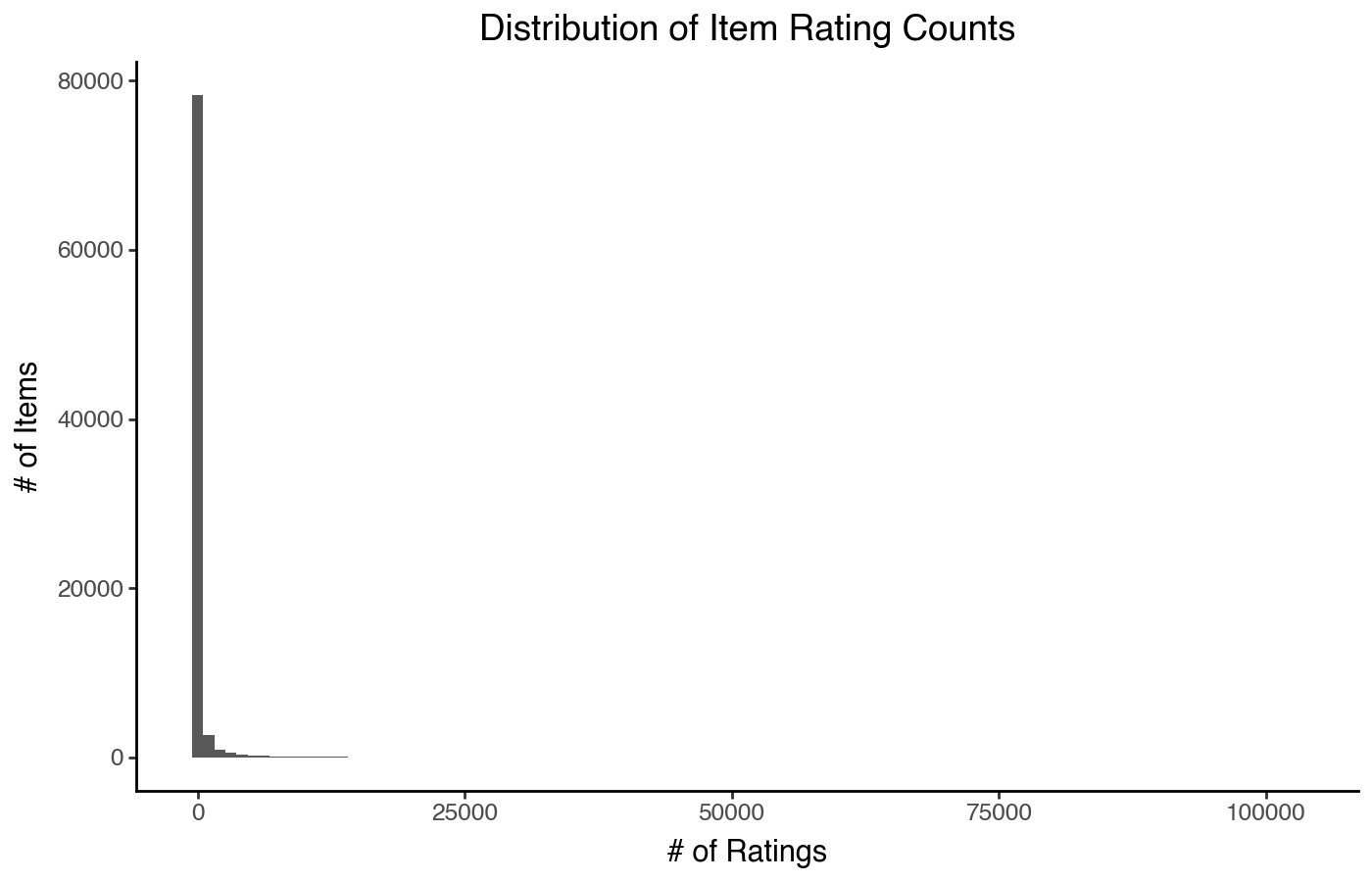
Or really skewed?
(
    pn.ggplot(item_stats)
    + pn.aes(x='count')
    + pn.geom_histogram(bins=100)
    + pn.labs(x='# of Ratings', y='# of Items')
    + pn.ggtitle("Distribution of Item Rating Counts")
)
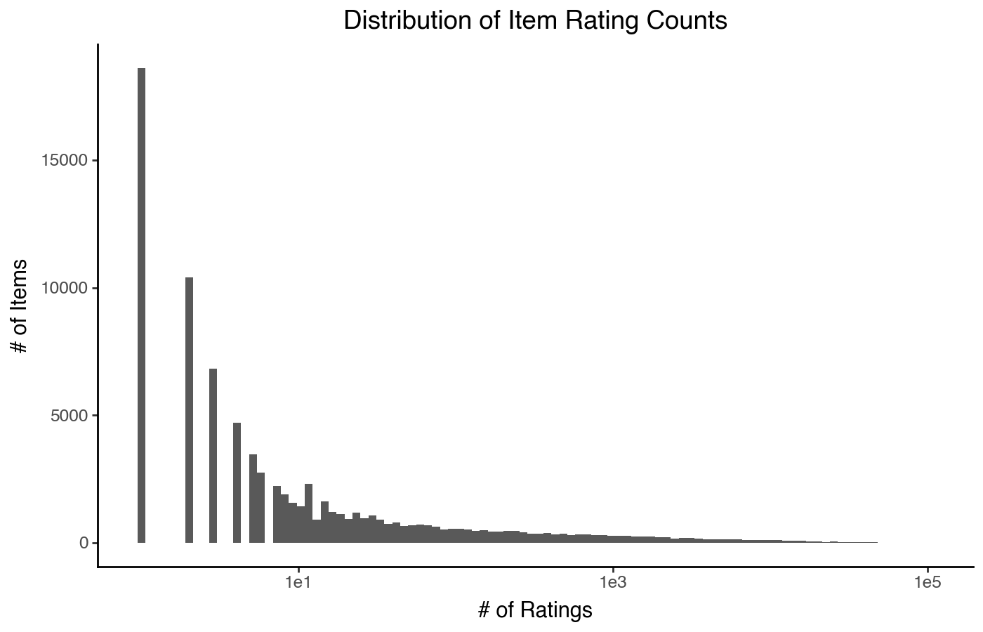
We can put the X-axis on a log scale, which looks a little funny but mostly works (in Plotnine, at least — not all plotting software has good support for this):
(
    pn.ggplot(item_stats)
    + pn.aes(x='count')
    + pn.geom_histogram(bins=100)
    + pn.scale_x_log10()
    + pn.labs(x='# of Ratings', y='# of Items')
    + pn.ggtitle("Distribution of Item Rating Counts")
)
But there are a few ways we can do better. There are at least 4 other designs for distribution plots that work quite well with heavily skewed data, and can illuminate the precise nature of the skew more clearly.
Scatterplot Histogram
The first is the scatterplot histogram. Like the histogram, it puts the quantity on the x axis and the number (or density) of items on the y axis; the difference is that with a scatter plot, we can put both axes on a log scale (we cannot do that with a histogram, because log-scaling bar chart heights is a misleading visualization design).
To do this, we typically need to compute the histogram ourselves.
item_count_hist = item_stats['count'].value_counts().reset_index(name='n_items')
(
    pn.ggplot(item_count_hist)
    + pn.aes(x='count', y='n_items')
    + pn.geom_point(shape='+')
    + pn.scale_x_log10()
    + pn.scale_y_log10()
    + pn.labs(x='# of Ratings', y='# of Items')
    + pn.ggtitle("Distribution of Item Rating Counts")
)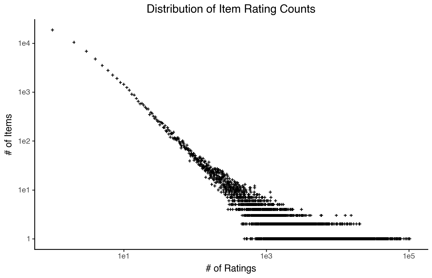
This type of distribution plot clearly shows a power law trend: a mostly straight line, expanding out into a funnel as the item counts reduce and data gets noisier. There is a lot of detail we can’t see, but if what we want to know is that it’s approximately power-law-distributed, this plot shows that.
Rank Frequency
A related plot is the rank frequency chart. It switches the
x and y axes, and intead instead of plotting the
number of ratings it plots items by their rank (from 1 to
n, where 1 is the most-popular item). The result is a plot of
item frequency (how often it appears) by rank (using
the 'first' tie-breaking method, so each item has its own
rank):
item_stats['rank'] = item_stats['count'].rank(method='first', ascending=False)
(
    pn.ggplot(item_stats)
    + pn.aes(x='rank', y='count')
    + pn.geom_point(shape='+')
    + pn.scale_x_log10()
    + pn.scale_y_log10()
    + pn.labs(x='Item Rank', y='Item Frequency')
    + pn.ggtitle("Item Rank-Frequency Chart")
)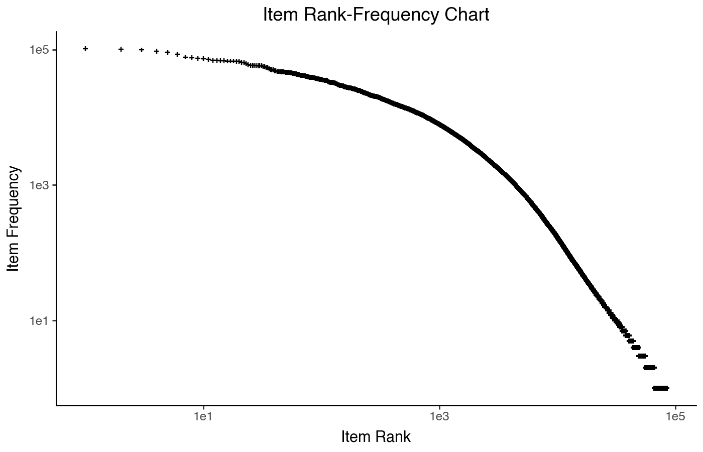
This chart, on log-log axes, shows a straight line until it curves down. If it was a straight line, it would be a specific power law distribution called a Zipf’s law distribution — a rank-frequency plot is the easiest way to visually check for that. Zipf’s law originated in lingustics, for understanding the relative frequency of different words in human language.
Because the idea of “frequency” in the original Zipf’s law analysis relates to humans uttering words, it is a natural fit for users rating or consuming items, but I probably would not use it to show the user popularity distribution. There’s no reason you can’t, in principle, it just isn’t as clean of a conceptual fit.
Empirical CDF Plot
The third plot I want to highlightis the empirical cumulative distribution plot. This plots either the values or their ranks on the x axis, and the y axis plots the cumulative fraction of items seen as you move from the left side of the plot. The y axis always goes from 0 to 1, and should not be logged (it is fine to log the x axis).
(
    pn.ggplot(item_stats)
    + pn.aes(x='count')
    + pn.geom_line(stat='ecdf')
    + pn.scale_x_symlog()
    + pn.labs(x='# of Ratings', y='Cumulative Frac. of Items')
    + pn.ggtitle("Distribution of Item Rating Counts")
)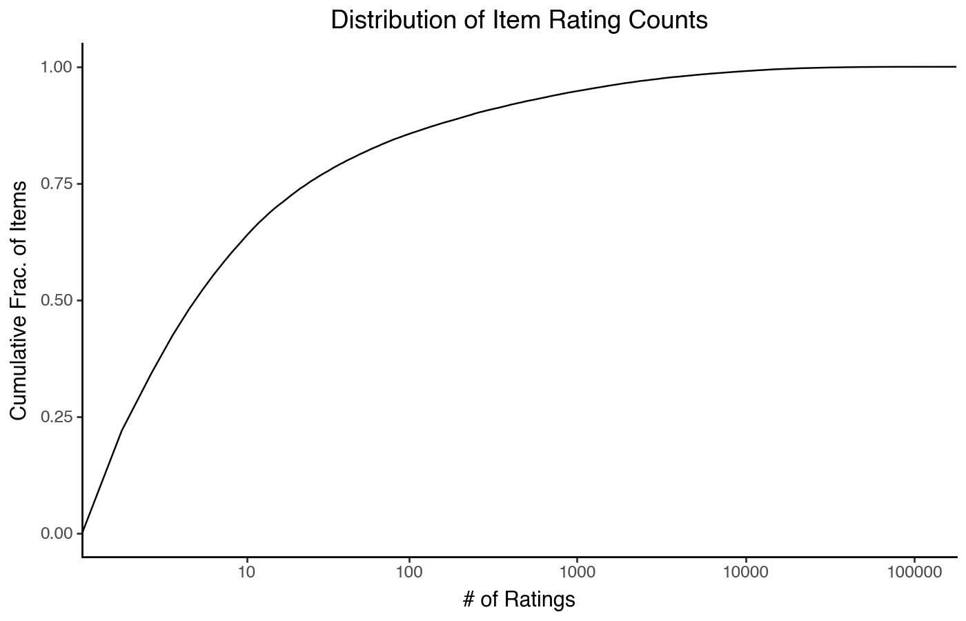
This plot can be a little hard to read on its own, but it can be quite good for comparing two distributions.
Lorenz Curves
The final plot method I want to demonstrate is the Lorenz curve. These curves come from economics to describe the distribution of a resource across a population; I find them very useful for visualizing how concentrated some resource (such as user attention) is.
To plot one, we plot the rank on the x axis (but this time
with the least-popular item at lowest rank, but again using
'first'), and the cumulative fraction of ratings
(not items) on the y axis, with both axes on a linear scale.
It’s also common to use real-valued ranks between 0 and 1 instead of
integer ranks, allowing Lorenz curves to be directly compared between
data sets with very different numbers of items.
item_stats['drank'] = item_stats['count'].rank(method='first')
item_stats['drank'] /= item_stats['drank'].max()
item_stats.sort_values('drank', inplace=True)
item_stats['cum_count'] = np.cumsum(item_stats['count']) / np.sum(item_stats['count'])
(
    pn.ggplot(item_stats)
    + pn.aes(x='drank', y='cum_count')
    + pn.geom_line()
    + pn.labs(x='Item Rank', y='Cum. Frac. of Items')
    + pn.ggtitle("Item Popularity Lorenz Curve")
)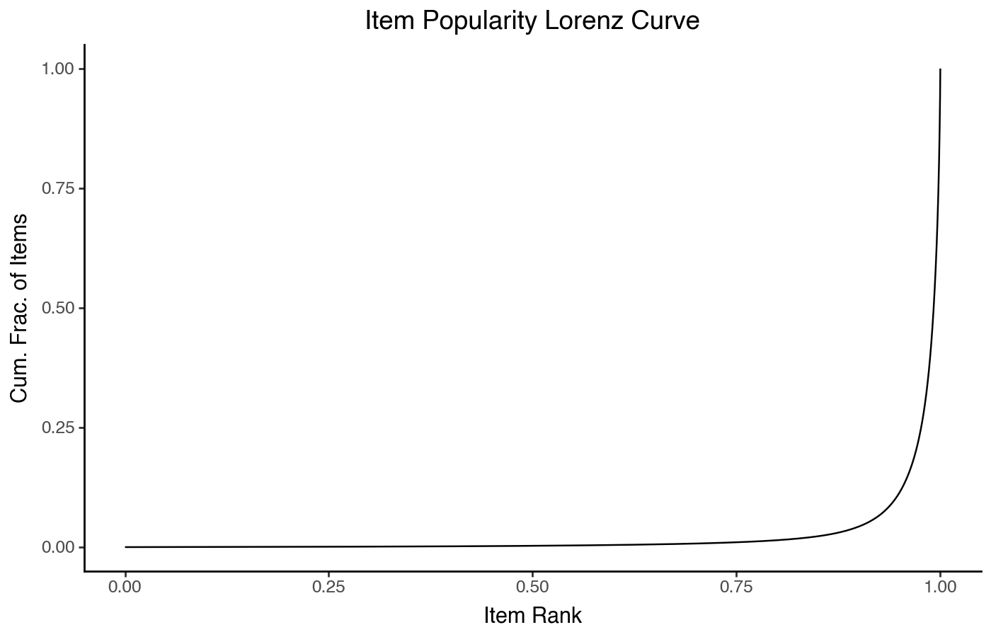
This shows a very sharp curve on the right — the further down and to the right the plot’s hard knee is, the more concentrated popularity is on a small number of items. It’s useful to overlay a 45º line on this chart to represent how the ratings would be distributed if every item was equally popular:
(
    pn.ggplot(item_stats)
    + pn.aes(x='drank', y='cum_count')
    + pn.geom_line()
    + pn.geom_abline(slope=1, color='rebeccapurple')
    + pn.labs(x='Item Rank', y='Cum. Frac. of Items')
    + pn.ggtitle("Item Popularity Lorenz Curve")
)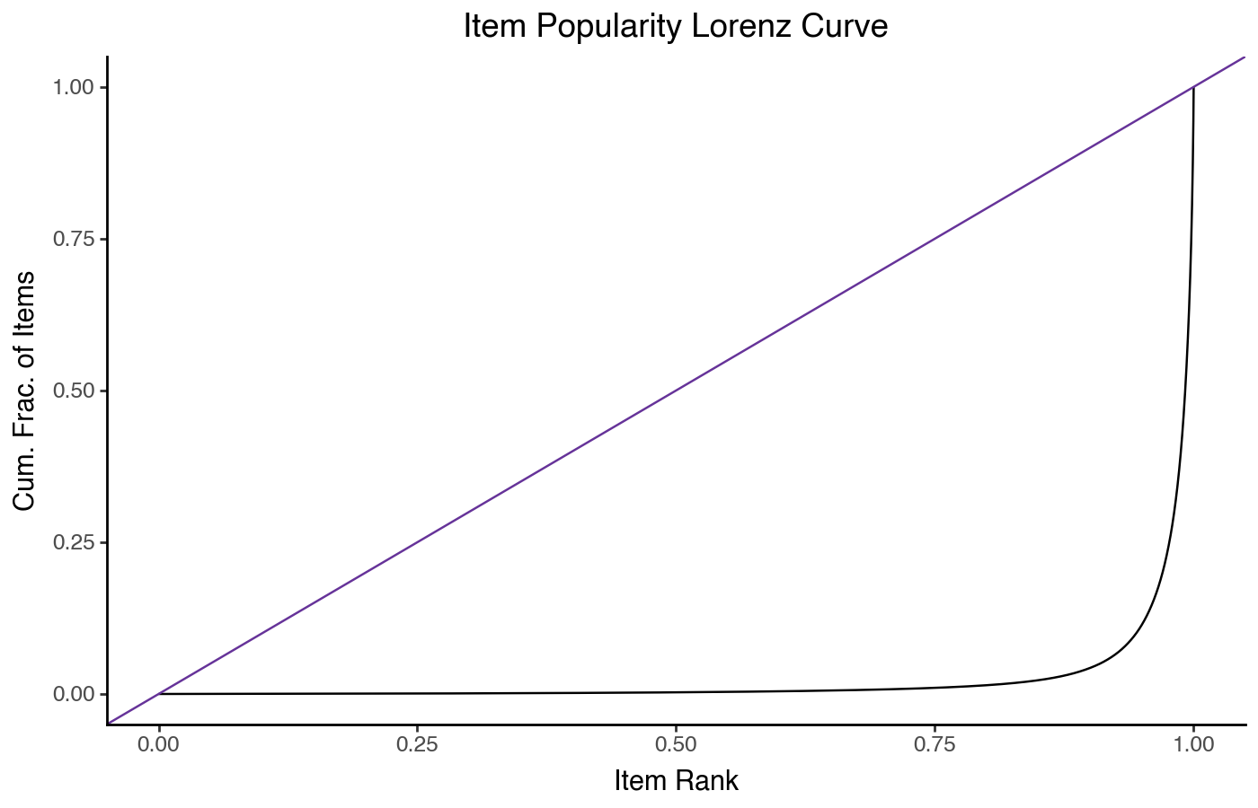
The Lorenz curve is also related to the Gini coefficient — specifically, the Gini coefficient is the fraction of area under the equality line that is between the equality line and the line curve from the data. At Gini=0, there is no gap and ratings are distributed equally; at Gini=1, all ratings are for a single item.
Lorenz curves are also good for comparing distributions.
Summary
Each of these different plots provides a different view on the data and emphasizes different things. Traditional histograms are good for a first look at relatively symmetric data, but break down with heavily skewed data, and also can’t practically be overlayed to compare different distributions. KDE plots help with comparison, at the expense of introducing a statistical model (the kernel density estimator) with parameters that can affect its output instead of directly showing the data.
Scatterplot histograms and rank-frequency charts are good for visually identifying different types of power-law distributions. With practice, empirical CDF plots are good for comparing distributions, and support log-scaled x axes to visualize skewed distributions. Whether to prefer an empirical CDF or a KDE plot is both a function of familiarity, and of modeling — the empirical CDF plot is directly showing the data instead of a density estimate, but it takes more practice to read.
The Lorenz curve makes resource concentration apparent in a way that admits a natural quantiative description of that concentration; for things like item popularity, I find them a very good solutoin for quickly highlighting the most important aspects of such highly-skewed distributions.